6 February, 2023
Hello and welcome to this week’s JMP Report
We have seen relatively low activity on the local bouse as everyone moves back into the swing of the trading year, although last week we saw four stocks trade, BSP, KSL, STO, and CPP. BSP traded some good volume, 1,642,079 shares trading unchanged at K12.41, KSL saw 144,616 shares trade down 1 toea to close at K2.79. STO traded 996 shares unchanged at K19.10 while CCP traded 10,000 shares trading unchanged at K1.90.
Refer details below
WEEKLY MARKET REPORT | 28 January, 2023 – 03 February, 2023
| STOCK | QUANTITY | CLOSING PRICE | CHANGE | % CHANGE | 2021 FINAL DIV | 2021 INTERIM | YIELD % | EX-DATE | RECORD DATE | PAYMENT DATE | DRP | MARKET CAP |
| BSP | 1,642,079 | 12.41 | – | – | K1.3400 | K0.34 | 13.53 | FRI 23 SEPT 22 | MON 26 SEPT 22 | FRI 14 OCT 22 | NO | 5,317,971,001 |
| KSL | 144,616 | 2.79 | -0.01 | -0.36 | K0.1850 | K0.0130 | 9.93 | MON 5 SEPT 22 | TUE 6 SEPT 22 | TUE 4 OCT 22 | NO | 64,817,259 |
| STO | 996 | 19.10 | – | – | K0.2993 | K0.26760 | 2.96 | MON 22 AUG 22 | TUE 23 AUG 22 | THU 22 SEPT 22 | – | – |
| KAM | 0 | 0.95 | – | – | – | – | – | – | – | – | YES | 49,891,306 |
| NCM | 0 | 75.00 | – | – | USD$0.075 | K0.70422535 | – | FRI 26 AUG 22 | MON 29 AUG 22 | THU 29 AUG 22 | – | 33,774,150 |
| NGP | 0 | 0.69 | – | – | – | – | – | – | – | – | – | 32,123,490 |
| CCP | 10,000 | 1.90 | – | – | K0.134 | – | 6.19 | MON 19 SEP 22 | TUE 27 SEP 22 | FRI 18 NOV 22 | YES | 569,672,964 |
| CPL | 0 | 0.95 | – | – | K0.04 | – |
4.20 |
TUE 5 APR 22 | THU 14 APR 22 | FRI 29 APR 22 | – | 195,964,015 |
Please note our alert sent separately regarding Non-binding indicative offer from Newmont”
Dual listed PNGX and ASX
BFL – 4.90 +22c
KSL – .775 -.05
NCM – 22.45 +3c refer to market announcement on Non Binding offer- Note market trading at $25 at 14.25hrs today
STO – 7.00 -24c
The alternatives
Gold – 1874
Oil – 73.58
Bitcoin – 33,766
Binance 22,912
Ethereum – 1,627
Interest Rates
In the interest rate market, we would expect to see some indication of the 2023 Government Inscribed Stock Program commence sometime in February.
In the short end, TBills have come down hard over the last 4 weeks with 364 day rates averaging 2.96%, BPNG did meet the market to some degree buy issuing a further 100mill.
The Finance Company money rates also reflects the downward pressure with 360 day rate offered at 2% with FIFL.
What we’ve been reading this week
Oliver’s insights – Australian v global shares
Dr Shane Oliver – Head of Investment Strategy and Economics and Chief Economist, AMP Investments
Key points
– The underperformance of Australian versus global shares since 2009 reflects a combination of tighter monetary policy, the strong $A into 2011, the slump in commodity prices, property crash phobia and classic mean reversion.
– Australia’s performance is much better if dividends are allowed for, but it has still underperformed since 2009.
– With the prior outperformance in the 2000s resources boom now reversed there is good reason to expect Australian shares to outperform over the next 5-10 years.
Introduction
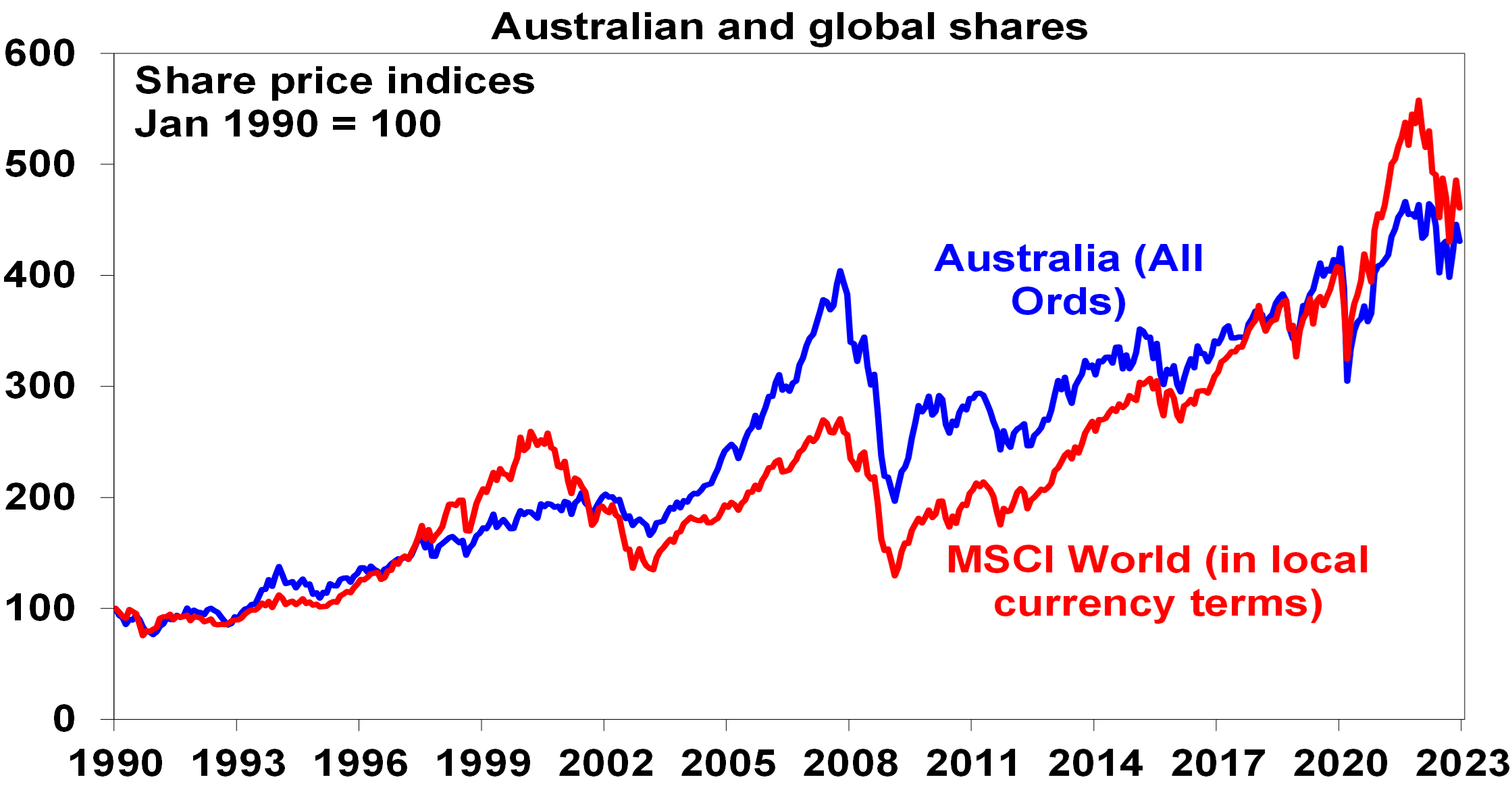
Since the March 2009 Global Financial Crisis (GFC) low in share markets, Australian shares are up 138%, compared to a 310% gain in global shares in local currency terms and a 500% gain in US shares.
Source: Bloomberg, AMP
Last year though Australian shares outperformed global shares, helped by strong commodities and a less hawkish RBA. The big question is whether the structural underperformance by Australian shares since 2009 is over?
Why have Australian shares underperformed?
To get a handle on the future, it’s useful to understand the past. The underperformance of Australian shares since 2009 reflects a mix of:
- Payback for its huge out performance in the 2000s – Australian shares go through periods of relative out & under performance. This can be seen in the next chart that shows the relative decade by decade real returns of global and Australian shares since 1940. Australian shares outperformed in the 1940s, unperformed in the 1950s, outperformed in the 1960s resources boom years, under performed in the high inflation 1970s and 80s, outperformed in the 1990s (although this was marginal and Australia under performed in the second half of the 1990s when the tech boom raged), outperformed dramatically in the resources boom of the 2000s and under performed in the 2010s.
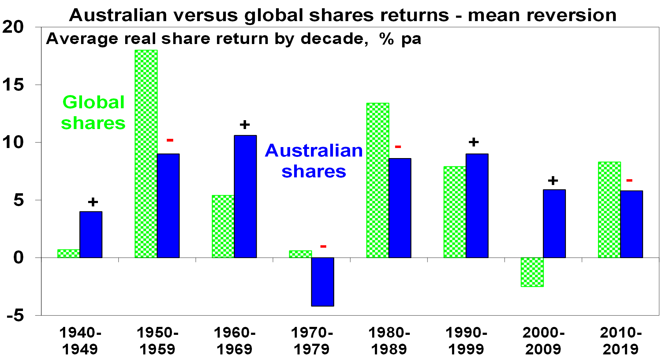
Source: ABN-Amro Global Investment Returns Yearbook, Bloomberg, AMP
The swings in relative performance can also be seen in the next chart which shows the ratio of Australian share prices to global share prices.
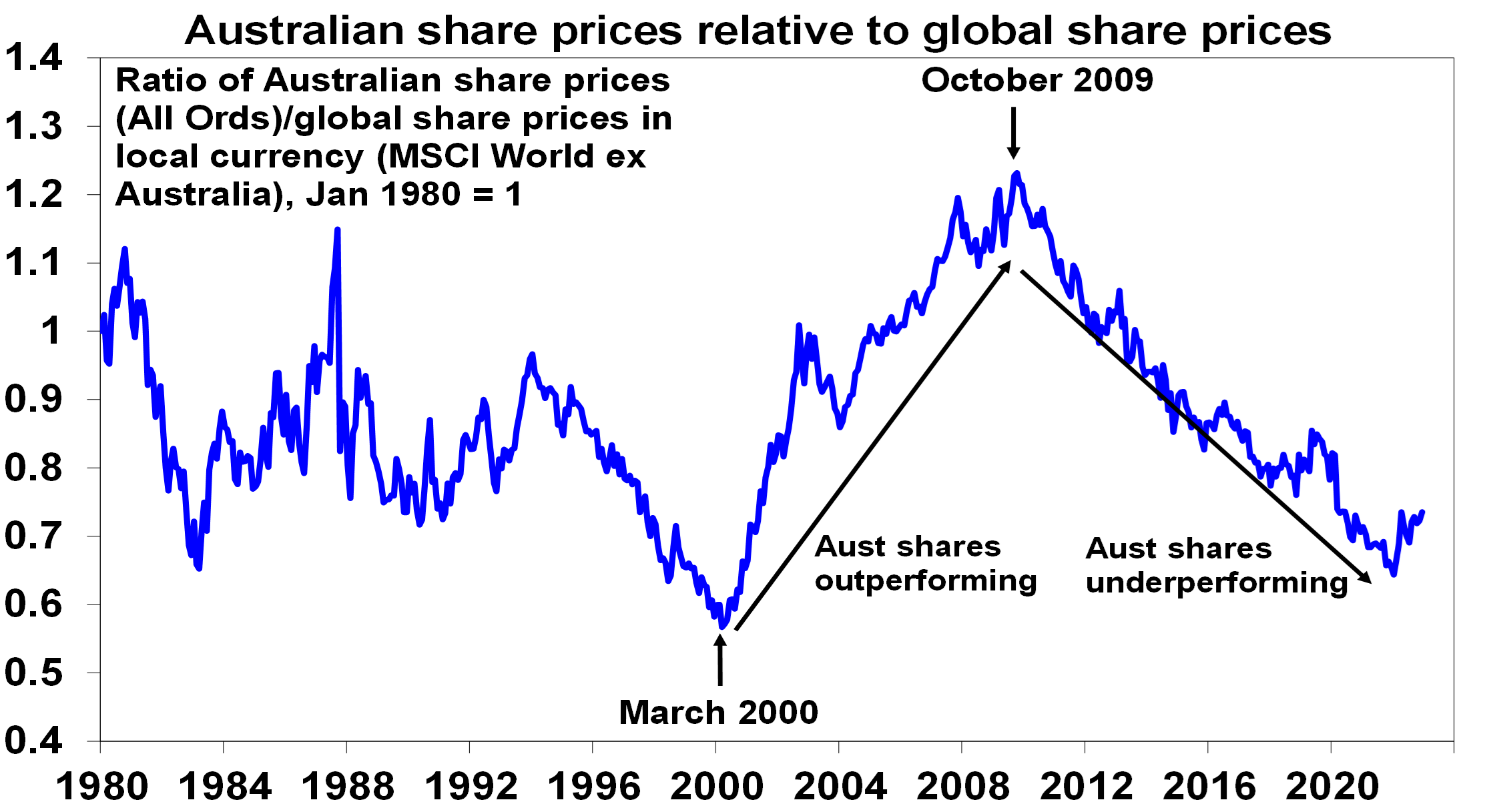
Source: Bloomberg, AMP
After underperforming global shares in the tech boom in the second half of the 1990s, Australian shares came roaring back in the 2000’s resources boom. This meant the 2007 high for Australian shares was a much higher high than for global shares which spun their wheels in the 2000s. So, the poor relative performance of Australian shares since 2009 is partly payback for their out performance in the 2000s.
- The slump in commodity prices from 2011 – this weighed heavily on Australian resources shares through much of last decade.
- Relatively tighter monetary policy in Australia for much of the post GFC period – whereas the US, Europe and Japan had near zero interest rates and quantitative easing, Australia has had much higher rates and no money printing until the pandemic. In fact, the relative under performance started in October 2009 when the RBA raised rates post GFC which wasn’t followed by other major countries.
- The surge in the $A to $US1.10 in 2011 – this reduced the competitiveness of Australian companies which takes time to reverse.
- Property crash phobia – foreign investor fear of a crash in Australia’s expensive housing market has been a periodic theme over the last decade leading many foreign investors to be cautious of Australia.
- Worries about the deteriorating relationship with China – this started in 2018 with President Trump’s trade war but was accentuated through the pandemic. It arguably resulted in foreign investors demanding a risk premium to invest in the $A and Australian shares.
- A low exposure to pandemic winners – like tech stocks, which helped the US share market and hence global shares in 2020 & 2021.
Are high dividend payouts to blame?
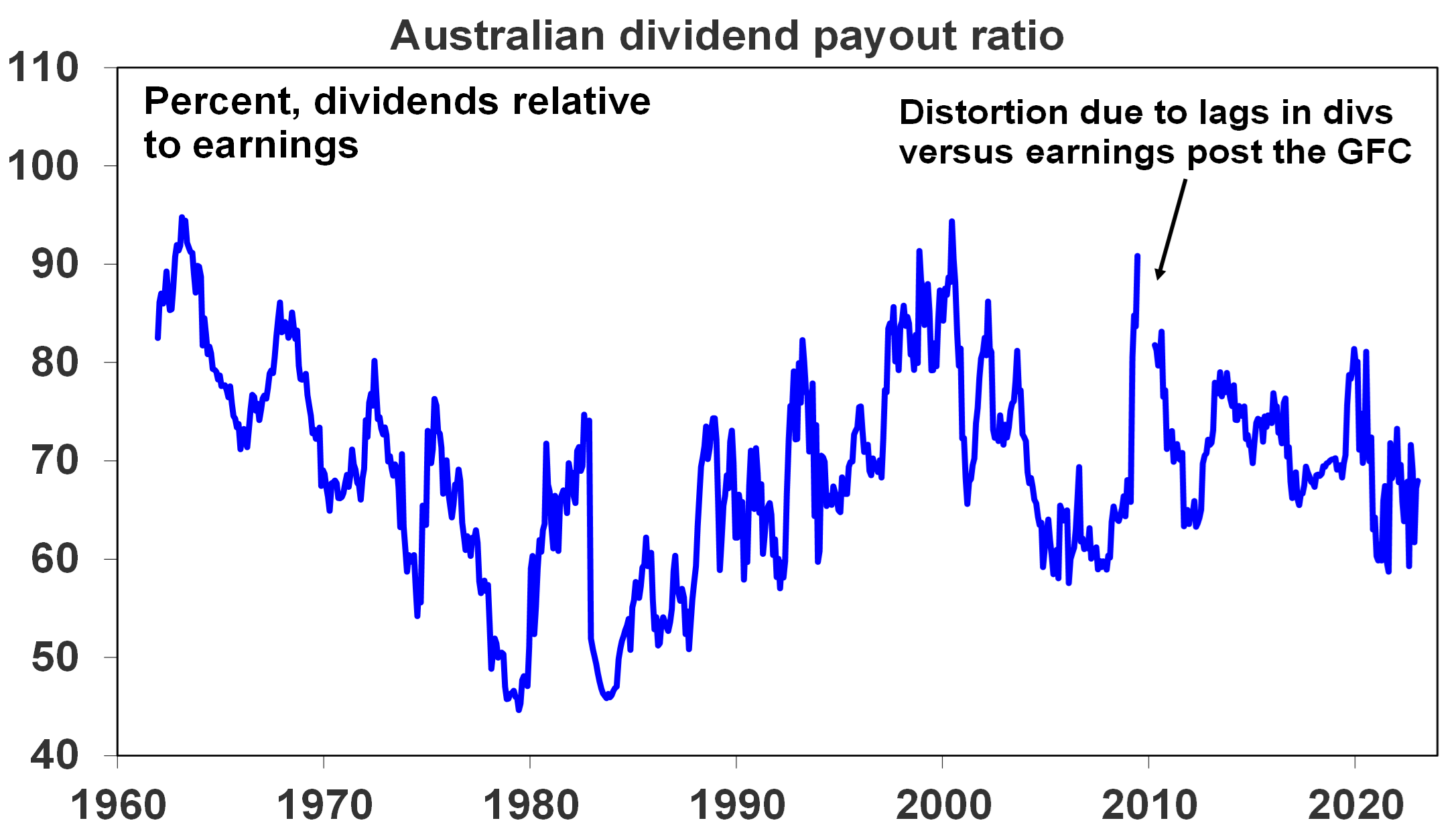
An often expressed view is that Australian companies are not investing because shareholders want high dividends and this could be causing poor profit growth & share returns. This is unlikely. The dividend payout ratio (ie dividends relative to earnings) is not out of line with its historic norm.
Source: Bloomberg, RBA, AMP
Australia’s high dividend payouts are in fact healthy from a long-term perspective. There is evidence that high payouts actually drive higher earnings growth and share returns as: high dividend payouts mean less risk of poor investment decisions from retained earnings; they are indicative of corporate confidence about future earnings; & they indicate earnings are real and not an accounting fiction.
In fact, because Australian shares pay relatively high dividend yields (around 4.4%) compared to global shares (2.5%) they should be included in comparisons of Australian with global share market returns. The next chart compares the relative performance of Australian to global shares since 1970 in terms of: relative share prices in local currency terms (green line); relative total returns ie with dividends added in (blue line); and relative total returns with global shares in Australian dollars (red line).
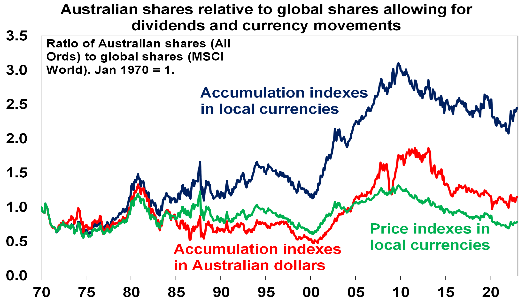
Source: Thomson Reuters, Bloomberg, AMP
A rising ratio means Australian out performance and vice versa. Several things stand out. First over long periods of time and when dividends are allowed for Australian shares have had better returns than global shares. Since 1970 Australian shares have returned (capital growth plus dividends) 10.1% per annum compared to 8.2% pa for global shares in local currency terms. The falling $A over this period has enhanced the return from global shares to 9.8% pa but they still under performed Australian shares. Second, the swings in the relative performance of Australian shares are apparent if dividends and currency movements are allowed for or not – in particular in the big out performance in the 2000s and under performance since 2009. Since October 2009, when Australian shares peaked relative to global shares, Australian shares have returned 7.7% pa compared to 9.7% pa from global shares in local currencies or 11.3% pa in $A terms (as the $A fell).
Seven reasons Australia’s under performance is likely over
Over the last year Australian shares have outperformed global shares and the various comparisons in the last chart have hooked higher. It could just be noise, but several fundamental considerations suggest that the structural relative under performance since 2009 is likely to be over:
- Mean reversion – after 12 years of under performance & the reversal of the 2000s out performance Australian shares are due for a lengthy period of out performance. Consistent with this, Australian shares are trading on a lower forward price to earnings multiple of 14.5 times than global shares on 15.3 times & US shares on 17.1 times.
- A new super cycle in commodities – the commodity price slump from their 2008-2011 highs looks to be over with commodities embarking on a new super cycle bull market driven by constrained supply after low levels of investment and low inventories for most commodities, decarbonisation driving increased demand for metals and increased defence spending on the back of increased geopolitical tensions which is metal intensive. This will benefit Australia’s resource stocks.
- The $A is no longer expensive – the surge in the $A to $US1.10 of 2011 has long ago reversed with the $A hitting a low of $US0.57 in 2020 & $US0.62 last year making Australian companies more competitive.
- Stronger growth potential – Australia’s potential growth rate remains higher than the US, Europe & Japan due to higher population growth.
- Relatively high dividends – Australian shares pay a higher dividend yield than traditional global shares: 4.4% versus 2.5%. This is important because dividend payments are a big chunk of the return an investor will get and so the higher the better. Franking credits add around 1.3%pa to the post tax return for Australia-based investors.
- Less aggressive monetary tightening – RBA monetary policy is no longer relatively tight compared to other major central banks, notably the Fed. It has been taking a more balanced approach to returning inflation to target. Higher than expected December quarter inflation is a concern and is now likely to see the RBA hike rates by another 0.25% in February. But its likely to be the peak in inflation as supply is improving, freight costs have fallen and demand is slowing and its unlikely to see the RBA adopt a more aggressive policy compared to other major countries.
- A thawing in the China relationship – the risk of a sharp deterioration in the trade relationship with China appears to be receding (at least for a while) helped by a change of Government in Australia.
Finally, while Australian property prices likely have more downside there is no sign of a property crash dragging down banks and the economy into recession. In the absence of much higher interest rates this looks unlikely.
Concluding comment
The period of under performance in Australian shares compared to global shares since 2009 is likely to be over. Expect a 5-10 year period of trend out performance, albeit there will be bumps along the way.
GOLD DEMAND TRENDS FULL YEAR 2022 – WORLD GOLD COUNCIL
Article care of Ainslie Bullion
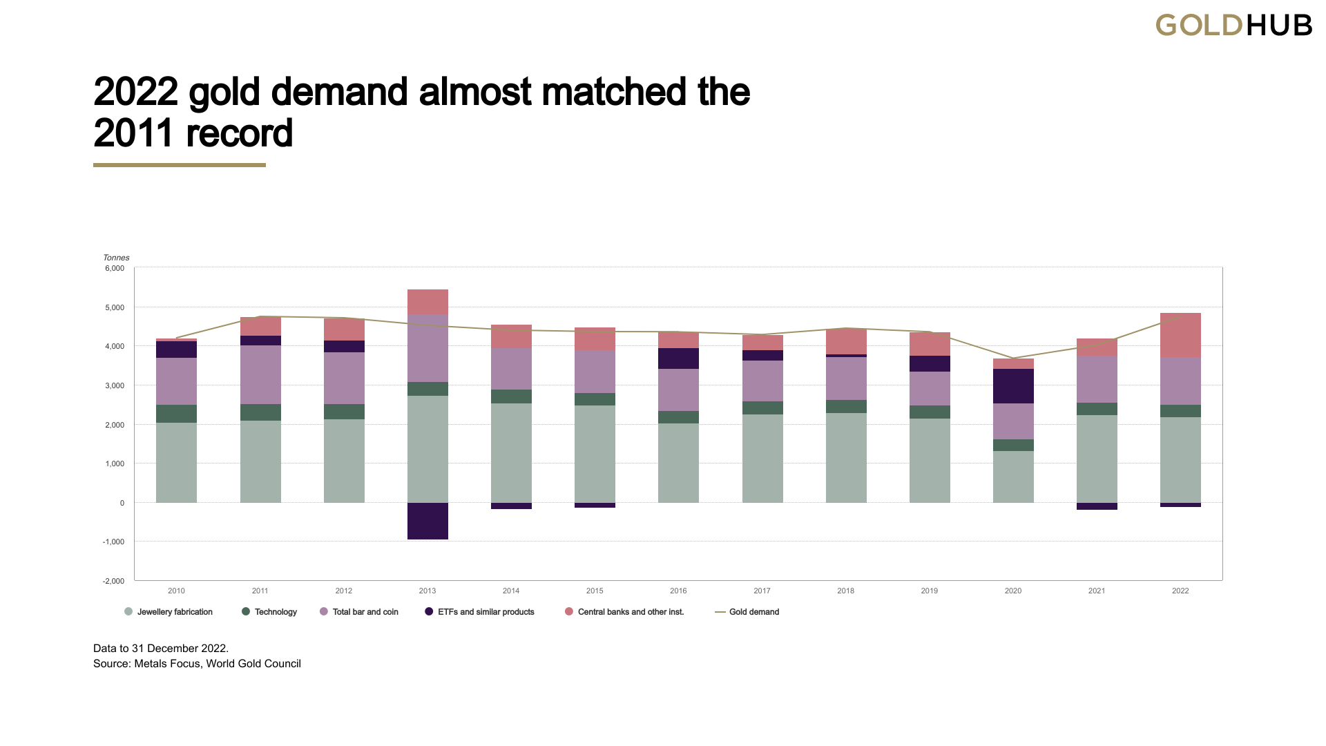
Each quarter we present the World Gold Council’s Gold Demand Trends reports but this time it includes their whole of 2022 data. In short the headline says it all with “2022: strongest year for gold demand in over a decade”. So let’s see what they had to say about the year of 2022 and our take on what this all means.
“Colossal central bank purchases, aided by vigorous retail investor buying and slower ETF outflows, lifted annual demand to an 11-year high
Annual gold demand (excluding OTC) jumped 18% to 4,741t, almost on a par with 2011 – a time of exceptional investment demand. The strong full-year total was aided by record Q4 demand of 1,337t.”
As we covered in our own end of 2022 Wrap gold actually held fairly steady over the year, albeit against heavy falls in nearly every other asset class. Interestingly though, its consistency over the year actually saw it post a record annual year high average spot price of US$1800/oz. Of course so far in 2023 Mr Consistency has rallied nicely to US$1930 at the time of writing already. So lets see what they had to say per sector, starting with the one closest to our heart, investment demand:
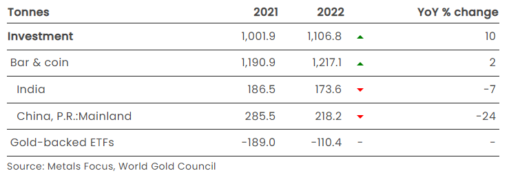
Investment
- Global bar and coin demand improved on the already healthy 2021 total, gaining 2% to 1,217t
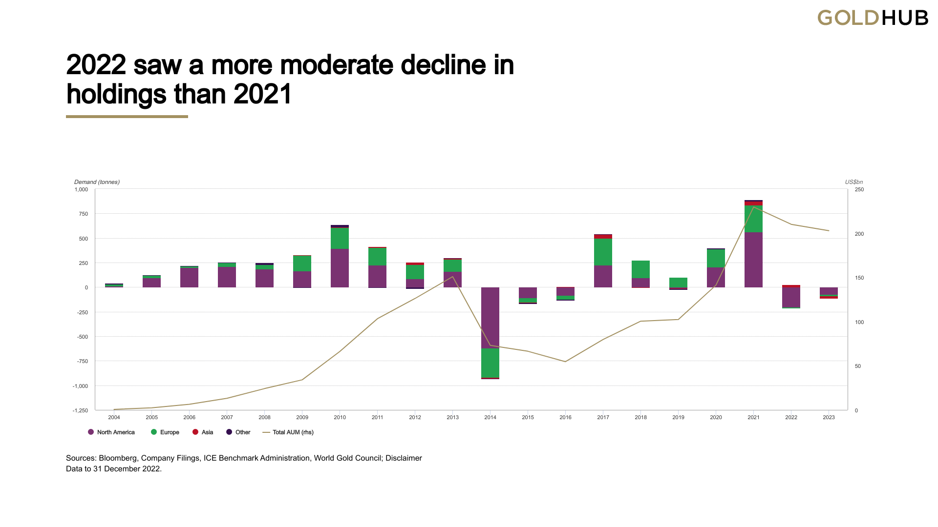
- Despite Q1 gains, gold ETF holdings fell by 110t in 2022 but this was significantly lower than the 189t of net selling seen in 20211
- Total annual investment increased 10% to 1,107t.
“2022 was a textbook example of how gold’s diverse sources of demand and supply can counterbalance one another, providing gold with its uniquely stable performance as an investment asset.
ETF investment was weak, albeit improved from 2021; in contrast, retail bar and coin buying was strong, driving gold to a marginal gain in 2022. The anaemic sentiment in ETFs was also reflected in managed money net positioning on COMEX, which oscillated between net long and net short in H2 2022.
As well as underlying support from geopolitics, gold investment was impacted by a combination of multi-decade high inflation, especially in Western markets, and the resultant aggressive rate hikes by the Fed and other central banks. Bar and coin investors focused on the former and sought the safety of gold as a hedge against inflation. In contrast gold ETF investors reduced their holdings, especially in the second half, focusing on gold’s rising opportunity cost as central banks across the globe imposed hefty rate hikes and the US dollar surged.”
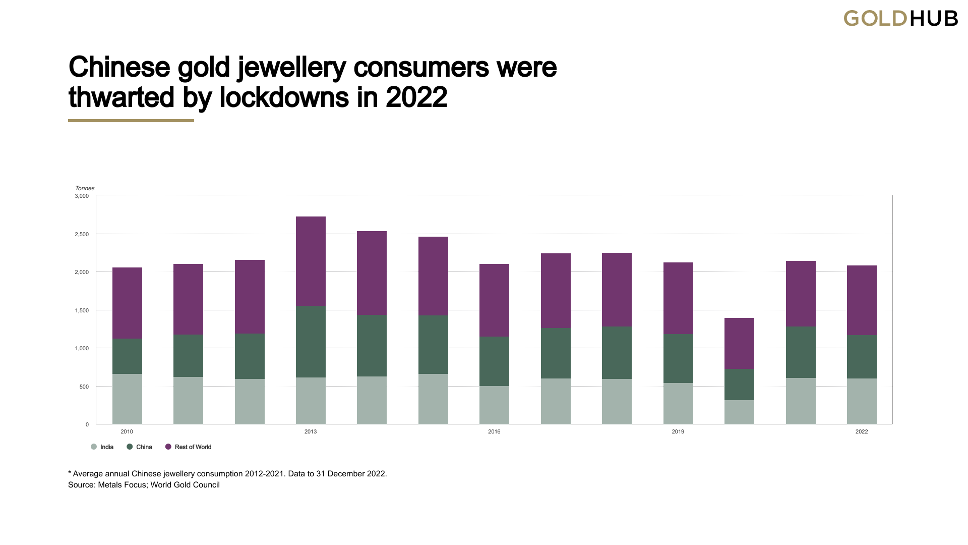
The breakdown of the physical gold investment demand is very interesting and hasn’t been discussed that much. Whilst everyone was looking at China’s central bank buy up their private consumption was hit by COVID lockdowns:
“Q4 bar and coin demand in China fell 20% y-o-y to 61t, taking the full year total down 24% to 218t, due mainly to COVID-related restrictions throughout the year.
Annual retail investment was 18% below its 10-year average of 269t and was more in line with the 199t of demand in 2020 – a year also affected by lockdowns.”
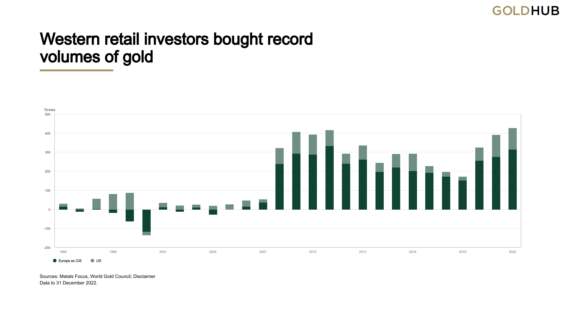
On the other hand we saw record demand from the west:
“Western investment demand for physical gold products reached an annual record in 2022. Combined US and European purchases of gold bars and coins hit 427t, exceeding the previous record of 416t in 2011.”
The following chart is a beautiful illustration of the realisation of the lessons from the GFC and the doubling down response of central banks debasing our monetary system. i.e. since 2008 more and more people are turning to real money as fiat ‘money’ is debased at a record pace and the implications of the inevitable outcome of history’s biggest credit bubble become abundantly clear to anyone paying attention…
WGC (through Metals Focus) now report on Australia and had this to say:
“Investor appetite for gold remains fairly strong on the back of concerns about global economic malaise, high inflation and the spectre of rising interest rates in an over-leveraged market. While retail investment demand remained lower than its impressive Q1 levels, it was robust at just over 4t. Overall 2022 retail investment demand of just under 20t was down 2% y-o-y.”
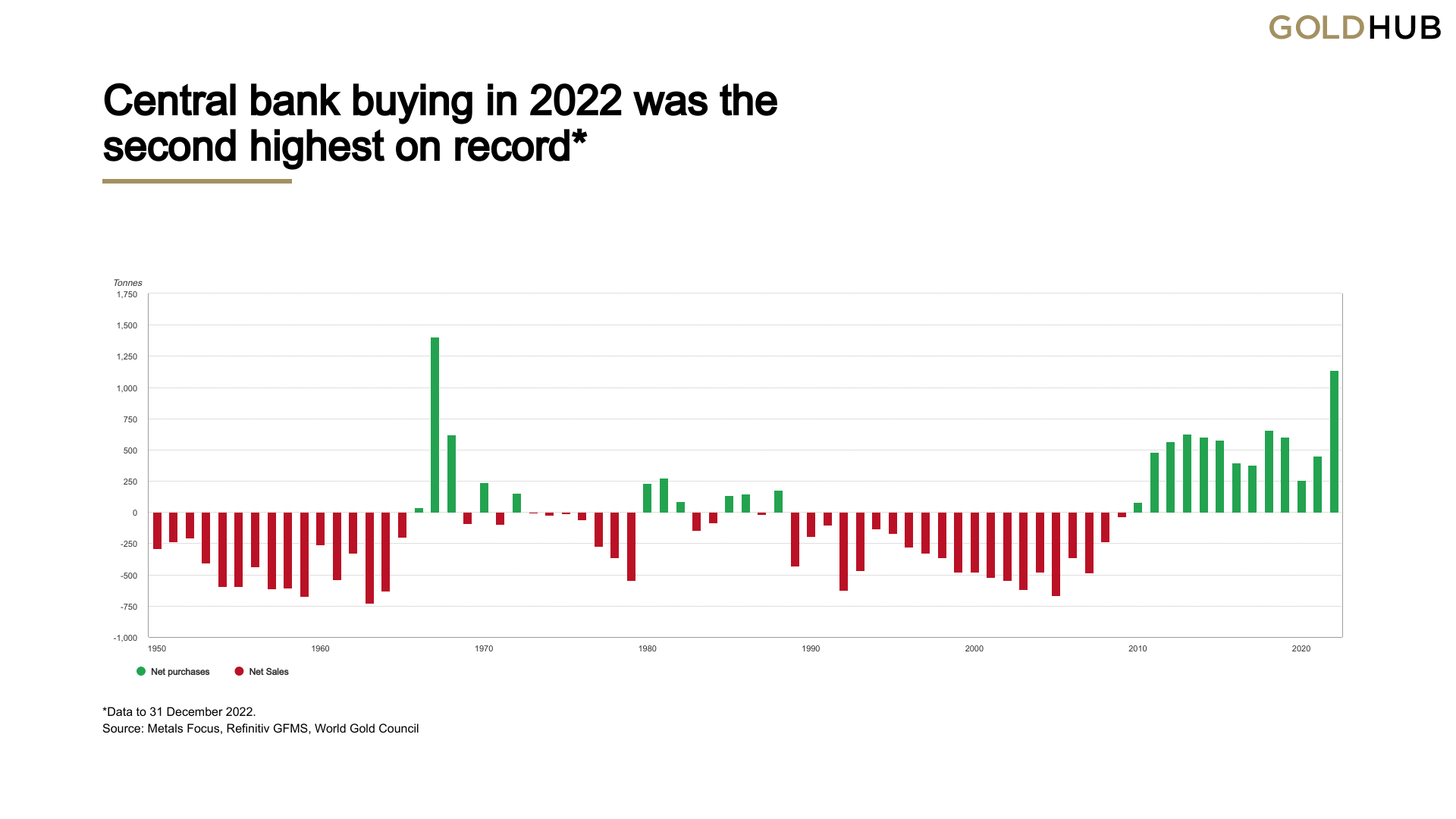
Central Banks
- Central bank demand totalled 1,136t in 2022, the highest level of buying since 1967. A 55 year high!
- Geopolitical uncertainty and high inflation were highlighted as key reasons for holding gold
- Buying was primarily from emerging market banks, including Turkey and China.
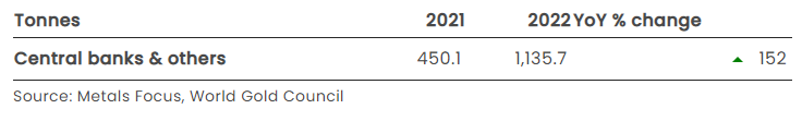
“Two years on from dropping to its lowest level in a decade, central bank demand has rebounded strongly. 2022 saw the second consecutive y-o-y increase in demand from this sector, with net purchases totalling 1,136t. This marked a banner year for central bank buying: 2022 was not only the thirteenth consecutive year of net purchases, but also the second highest level of annual demand on record back to 1950, boosted by +400t demand in both Q3 and Q4.”
Not to harp on, but… You see the trend here yeah? Since 1973 when this secular credit bubble started when we left the gold standard, investors and central banks alike no longer needed the ‘pet rock’ that was gold. Years and years of credit fuelled largesse and US abuse of its reserve currency hegemony ensued until the first reminder of it’s limits and inevitable catastrophic failure was dished up in the GFC. Since then, central banks, the very institutions doubling down on credit creation, have been buyers every single year and as we saw above, those investors who understand history as well.
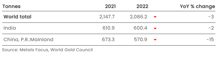
Jewellery
- Total annual jewellery demand saw a modest decline, 3% lower at 2,086t
- Steep declines in Chinese demand, weakened by COVID disruptions throughout the year had an outsized impact on the world total
- Global Q4 demand was down 13% y-o-y, a fall that was partly explained by the very high base of Q4’21 demand
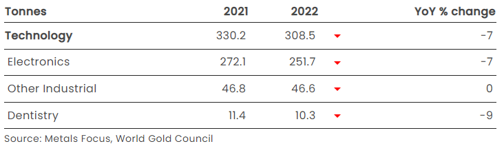
Technology
- Worsening global economic conditions in Q4, together with trade restrictions and supply chain issues, generated a sharp drop in full-year gold technology demand
- A substantial drop in Q4 compounded Q3 weakness to generate a 7% decline in annual demand for gold in technology
- Electronics demand mirrored the 7% annual decline in the broader sector, dropping sharply in Q4 in response to the deteriorating global economic picture and supply chain challenges, particularly in China
- Gold used in other industrial applications was flat for the year.
Supply
- Total supply increased 2% y-o-y in 2021 as mine supply and recycling both posted modest growth
- Annual mine production increased 1% y-o-y although remains below the record high seen in 2018
- 2022 saw the global hedgebook almost unchanged over the year ending at 167t
- Full year recycled gold supply increased by 1% but remains 30% below the all-time high seen in 2012, despite a record annual average gold price in 2022.
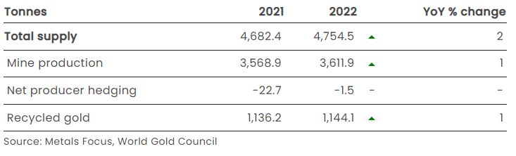
And for those closely watching to see if 2018 was indeed ‘peak gold’, that is still in play with last year’s 1% growth still below that peak.
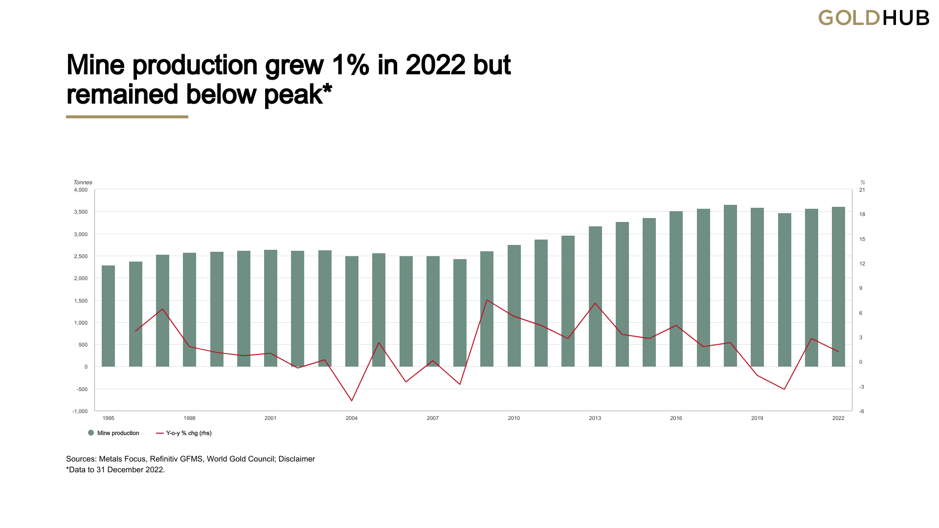
The supply numbers as always are important as they quietly remind us every single year that gold supply increases at barely 1 to 2% each year reinforcing its intrinsic value by virtue of stock-to-flow fundamentals.
USD money supply on the other hand…
No further comment needed but lets remember what Ray Dalio, head of the worlds largest hedge fund, famously said:
“If you don’t own gold… there is no sensible reason other than you don’t know history or you don’t know the economics of it…”
94% of Forest-Based Carbon Offsets Certified By Leading Global Provider Are ‘Phantom Credits,’ Major Investigation Finds
By: Olivia Rosane

The rainforest canopy. RollingEarth / Getty Images
Are carbon offsets a useful tool on the road to net zero or simply another form of greenwashing?
A new investigation from The Guardian, Die Zeit and SourceMaterial leads heavily toward the latter conclusion. The report, published Wednesday, found that more than 90 percent of the rainforest offset credits offered by top carbon standard Verra are actually what The Guardian called “phantom credits” that don’t actually remove carbon dioxide from the atmosphere.
“The implications of this analysis are huge,” Barbara Haya, who leads the Carbon Trading Project at the University of California, Berkeley, told SourceMaterial. “Companies are making false claims and then they’re convincing customers that they can fly guilt-free or buy carbon-neutral products when they aren’t in any way carbon-neutral.”
Verra currently certifies three-quarters of all carbon credits issued worldwide, according to SourceMaterial. This means that it considers a proposed carbon offset project–often the protection of at-risk forest–and issues it with a certain number of carbon credits equal to the tonnes of carbon dioxide it will remove or prevent from entering the atmosphere. These credits are then added to a global database that companies can purchase from to offset their emissions on the $2 billion voluntary carbon market. Verra certified one billion credits as of November of 2022, and these have been purchased by major companies including Gucci, British Airways, Disney, United Airlines, Air France, Samsung, Liverpool Football Club, Ben & Jerry’s, Netflix and Chevron.
Forty percent of Verra’s credits are generated by protecting rainforest. However, there is an inherent difficulty in verifying that protecting a forest would really offset emissions because it means somehow proving that the forest would definitely be felled without the financial support from the credit. Verra competitor Gold Standard won’t certify carbon credits based on avoiding deforestation, SourceMaterial pointed out.
The investigation, which took nine months to complete, looked specifically at three studies that used satellite images to verify the effectiveness of Verra’s forest-protection-based credits specifically, The Guardian explained. It backed this up with on-the-ground interviews and additional research.
More From EcoWatch
- How To Save Energy
- How To Lower Your Energy Bill
- Are Solar Panels Worth It For Your Home?
Two studies by an international team of researchers looked at forest projects totalling an advertised 95 million carbon credits, which should be enough to cancel out the yearly emissions of 25 coal plants, according to SourceMaterials. The studies assessed how much deforestation the projects actually prevented and therefore how many carbon credits they should have received. When the journalists compared the scientists’ numbers with Verra’s claims during the study period, they found that 94 percent of the Verra-certified credits likely did nothing to mitigate the climate crisis.
The second study, from a University of Cambridge-based team, looked at 40 projects and found that only four of them were responsible for 75 percent of the forest actually protected, according to The Guardian. The journalists concluded that, for 32 of the projects, the risk of forest loss was puffed up by around 400 percent.
“It’s safe to say there are strong discrepancies between what we’re calculating and what exists in their databases, and that is a matter for concern and further investigation. I think in the longer term, what we want is a consensus set of methods which are applied across all sites,” University of Cambridge forest ecology Professor David Coomes, who was a senior author on the Cambridge study, told The Guardian.
In addition to giving companies and consumers a false sense that they are offsetting real emissions, there were also human rights concerns about at least one Verra project considered by the investigation. Some forest dwellers in Alto Mayo, Peru, said they were forcibly evicted as part of a Verra-certified forest protection project there, that covered nearly 40 percent of Disney’s offsets between 2012 and 2020, as The Guardian reported further. Journalists spoke to a 39-year-old coffee farmer and father of eight named Abel Carrasco whose home was demolished by police in 2021, according to a video of the incident he shared with The Guardian.
“My children begged them but [the police] said they had to follow their orders,” Carrasco said. “They told us to get our things ready and leave. They said it’s a protected forest, nobody can be here. That’s why you’ve got to go.”
In response to the investigation, Verra said that the methodology of the studies did now allow them to reflect the reality on the ground. That is because the studies use “synthetic controls,” which compare the protected area to a control scenario as opposed to real, unprotected forests.
“Verra is disappointed to see the publication of an article in the Guardian, developed with Die Zeit and Source Material, incorrectly claiming that REDD+ projects are consistently and substantively over-issuing carbon credits,” the certifier said. “Verra worked closely with both publications in the run-up to the publication to explain why this claim is untrue, as it is based on studies that use a ‘synthetic control’ approach or similar methods.”
However, lead author on the two international studies Thales West said that Verra needed to prove that its way of assigning credits was actually more reliable.
“I wanted to know if we could trust their predictions,” West told Source Material. “The evidence from the synthetic controls suggests we cannot.”
I hope you have enjoyed this week’s read. I look forward to bringing you the Weekly Report with up to date PNG Market information along with some out of the norm interesting articles.
Until next week, remember, the worst investment decision you can make is not to start.
Regards,
Chris Hagan.
Head, Fixed Interest and Superannuation
JMP Securities
Level 1, Harbourside West, Stanley Esplanade
Port Moresby, Papua New Guinea
Mobile (PNG):+675 72319913
Mobile (Int): +61 414529814